Reviewing books, films, video games and all things science fiction.
Monday, 7 July 2014
Judging A Codex By Its Cover
Okay, before we begin, i'll freely admit this is something of a time-filler until I can properly cover the Ghazghkull codex. Still, this is a subject I feel needs to be brought up and pointed out. Why? Because it's a surprisingly easy way to track trends within Games Workshop and their general attitude towards armies.
The old saying is that you can't judge a book by its cover, but if you track the sorts of covers produced by Games Workshop you start to see they actually represent the contents fairly well. Presenting the indention of the author, the general approach by the writer and how the creative team handle the armies in question, at least for that edition. Don't believe me? Let's just use Codex: Space Marines as a starting example.
Now, back in the days of the Third and Fourth Editions these were the sorts of covers we used to have:
Now, both of them feature the same elements - Each has an army being led by heroes fighting against a massive horde, being shown in all their power but are taking casualties in the conflict. They are clearly fighting as a part of a group, and the military force itself is not being overly glorified by strolling through the enemy and massacring them en mass. This reflected a lot of the lore and approach to the game of this time, which had been moving away from the far more hero focused editions of old and, while having a special place for HQ choices, had a much broader focus on the army as a whole. Furthermore, while it had an edge which favoured them, the stories did not bend over backwards to glorify the armies they featured and was not afraid to showing them take casualties.
Then came the Fifth Edition codex:
It's definitely a bit of a departure from the original and it's not hard to see why. All of a sudden, rather than an army with have one marine with slightly shiner armour being pushed front and centre. The rest of the army is being pushed into the background, the the cover heavily emphasises a Chaos Space Marine being one-shotted by this warrior. Unsurprisingly this was an edition where the characters were being pushed far more as a bigger part of the army, and their role being expanded to make them have a far more crucial role. Suddenly the numbers of characters jumped up several times over, and stories were greatly emphasising them over the actual armies involved. Even when this was not specific heroes from the book, it would find a way to focus upon an extremely small number of figures above all others. Just to bring up three other covers from this edition:
This is a definite trend throughout the entire edition and reflects upon the way armies were being designed and their lore structured. In many examples, usually by bad authors, the armies were now getting landslide victories at every turn with only their less favoured sub-factions seeing anything close to defeats. Stories were less about the armies than they were characters involved and more or less everything seemed to keep pushing their importance above all.
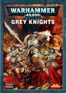
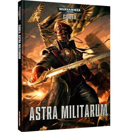
While there are certainly exceptions to this rule (the Fifth Edition Codex: Blood Angels Cover, Fourth Edition Codex: Orks cover) this seems to remain a continuing trend throughout the books. The Sixth and Seventh editions now have taken things to an entirely new level. Even ignoring the Codex: Inquisition example at the top of the page, just take a look at a couple of the big releases of late:
Things have been taken a step even further haven't they. Now the armies are gone entirely, replaced by a single HQ choice which takes up the entire cover. Beyond some minor background elements, nothing exists save for the characters it is completely focused upon. This is true of effectively every last codex the book of the last two editions, save for those recycling art from older works and sometimes not even then. Even the continually hero-centric Fantasy (which admittedly deals with this focus in a far more balanced way) is getting in on this with armybooks such as the High Elves now having only a single Lord choice on the cover.
This isn't any detrimental commentary beyond the obvious issues of the game being so character focused. I just wanted to highlight this as it's an interesting way to track Games Workshop's approach to its main franchises and how it changes over time
Subscribe to:
Post Comments (Atom)


I've been noticing this too, and I think it's a bit of a shame, because the big group shots have so much going on, that they're so much fun to look at, all the little details that the artist added are what makes it for me.
ReplyDeleteThese new covers are just boring, same with the inside depictions of the unit, they're not even making new artwork any more, just using pictures of the models and putting stats below, at the very least you'd hope this would mean they wouldn't need a gallery, but nope, that's still in full force.
One good thing I will say about it though is at least it keeps the armies feeling unified to sixth/seventh edition, and I like unified themes.